
Redesigning Information Access
Designing the Digital Ecosystem That Anchors the Creation of Life
A redesigned platform for clerical staff to navigate efficiently and accurately for urgent patient care at Michigan Medicine.
Client + Project Members
Research + Designers: - Joy Huang, - Olivia Pinto, - Erin Lee, - Emily Jennett, - Madeline Namy
My Role
- Field Research and Usability Tester on-site - Information Architect for page content
Impact
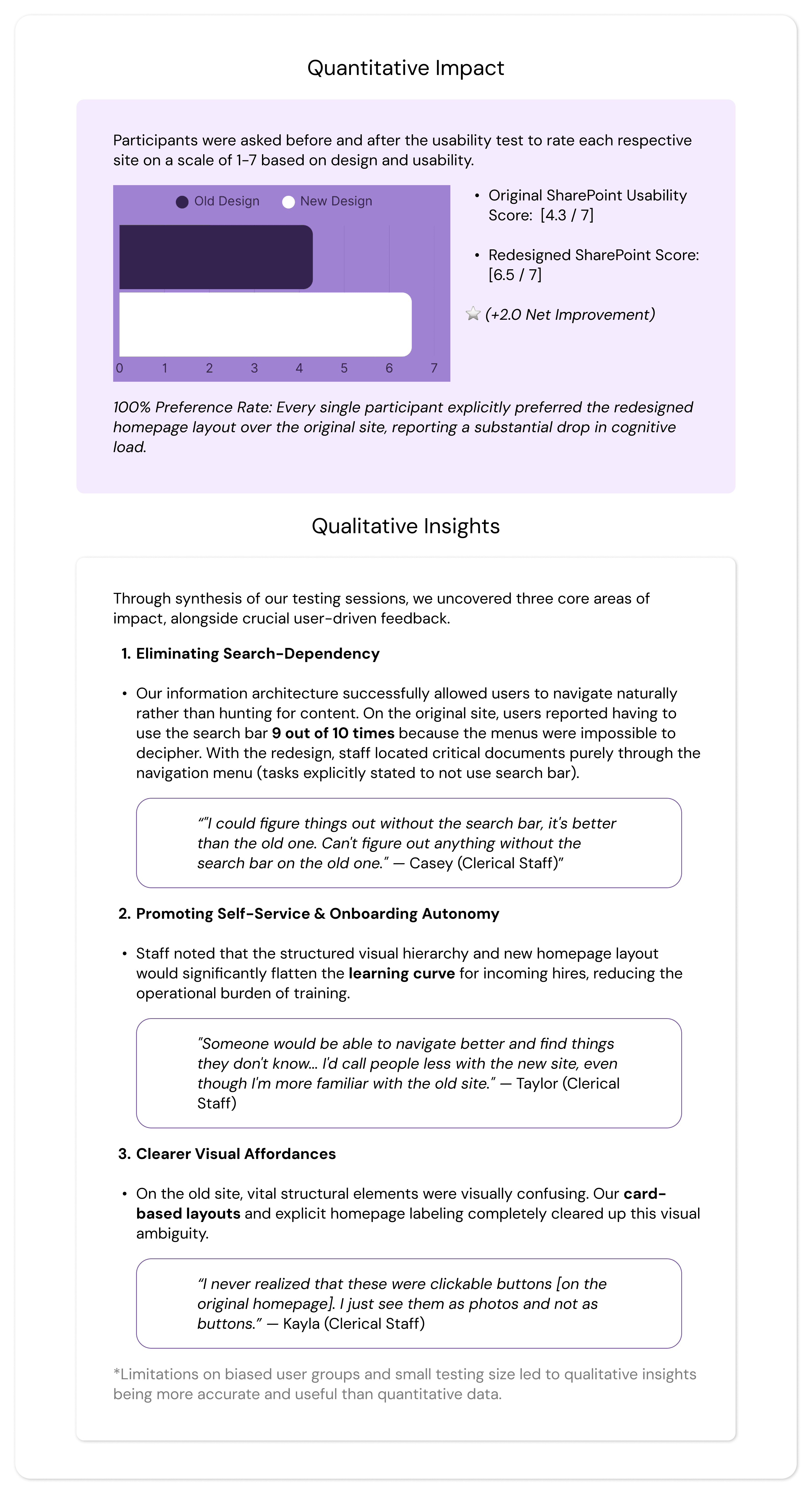
- 100% preference rate of redesign from users on easy access and learnability - 30% increase in reported usability - Handoff files to client contact allows for easy implementation on exisiting Sharepoint site
Date
Sept.-April 2026 | 28 weeks

To streamline patient care at Von Voigtlander Women’s Hospital, our client, our team of five redesigned the clerical staff's disorganized SharePoint site. Driven by user research, the intuitive new structure and dashboard eliminated navigation bottlenecks, reduced cognitive load, and achieved a 100% user preference rate during testing.
Problem Focus
Who our client is:
Part of the nationally ranked University of Michigan Health (Michigan Medicine) system, Von Voigtlander Women’s Hospital is a premier regional healthcare center and Michigan's first Level IV maternal care hospital. Operating 24/7, the facility manages over 133,000 patient visits and 5,400 deliveries each year, specializing in comprehensive obstetrics, gynecology, and the state's most complex high-risk pregnancy and neonatal intensive care cases. Coming to our UX team for help, this posed a responsibility for us to figure out what exactly the problem was and what they needed as users.
The Problem:
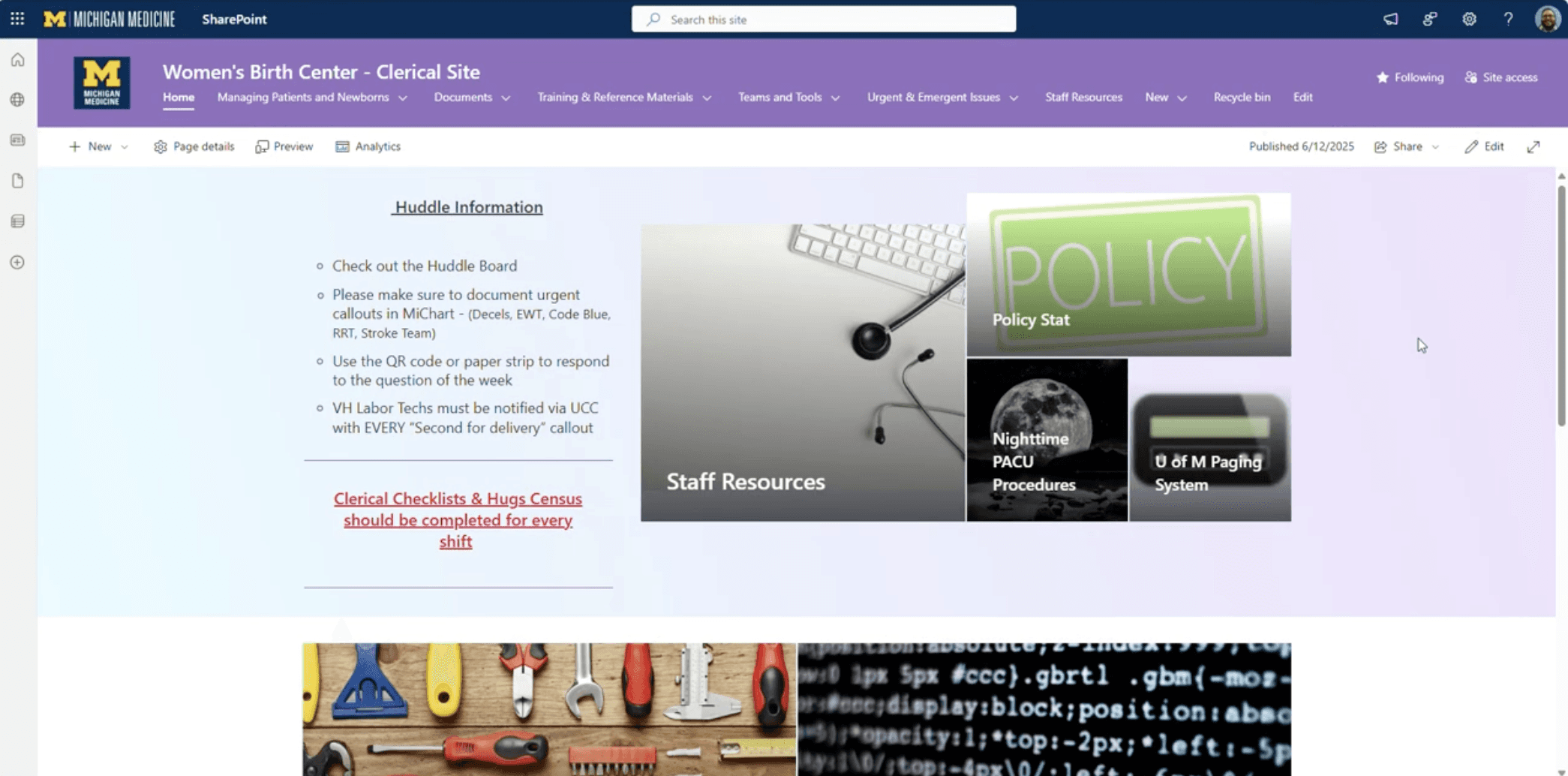
At Von Voigtlander Women’s Hospital, clerical staff face severe friction when using their internal SharePoint site to locate critical operational information. Because the platform lacks an intuitive information architecture, routine documents—such as consent forms, birth certificates, and patient menus—are deeply buried under inconsistent categories. Crucial navigation aids like breadcrumbs are missing, links are frequently broken, and onboarding documentation is so complex that new hires must rely on it like a "bible" just to survive the system. This fragmentation forces a staff operating under 24/7 high-pressure conditions to waste excessive time hunting for basic information spread across multiple confusing pathways.
(Original Site pictured below)
Why this matters:
Clerical staff serve as the communication and documentation backbone of the hospital; any digital bottleneck they experience directly ripples out into the wider care environment. Solving this issue is critical for three reasons:
Patient Care Quality & Workflow Speed: In a hospital setting, minutes matter. Delays in pulling up necessary forms or protocols directly translate to delayed workflows, slower communication between departments, and ultimately, a bottleneck in timely patient care.
Staff Cognitive Load & Burnout: Forcing staff to fight their software during a stressful shift adds massive cognitive load, causing unnecessary friction, confusion, and workplace frustration.
Onboarding Friction: The current learning curve severely hinders new team members. Fixing the platform ensures that incoming staff become autonomous, confident, and efficient significantly faster, reducing the training burden on veteran personnel.
Ultimately, resolving this digital disorganization was a critical operational optimization that directly protects both the well-being of the staff and the quality of patient care.
Research: Methodology
Overview:
Our research phase aimed to deeply understand the live SharePoint experience from the perspective of the Von Voigtlander Women's Hospital (VVWH) clerical staff, our primary users. The primary objective of this phase was to identify which workflows are most critical to their daily operations, map the digital obstacles slowing them down, diagnose systemic functionality gaps, and determine what user experience improvements could best reduce cognitive load. By uncovering where and why the current digital system disrupts clerical workflows, we established a data-driven foundation to optimize their digital workspace and, ultimately, protect the quality of patient care.
Research Questions:
To align our investigative efforts with our core project objectives, our research was guided by three central questions:
What specific operational situations prompt clerical staff to utilize the SharePoint site during their daily shifts?
In what ways does the current SharePoint system successfully support or actively disrupt routine and urgent task flows?
What are the primary friction points within the site that generate confusion, stress, or operational inefficiency for the staff?
By exploring these questions in context, our team was able to evaluate whether staff challenges were isolated usability issues or symptoms of broader information architecture misalignment and fragmented tool integration.
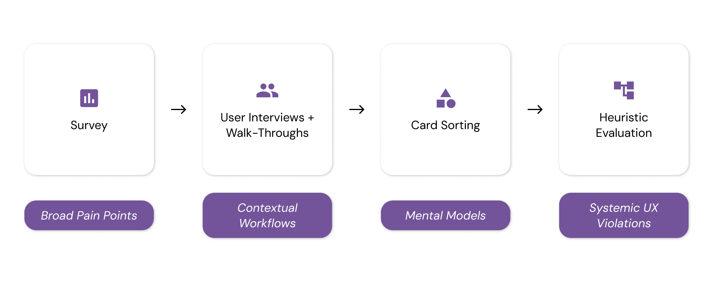
Research Methodology:
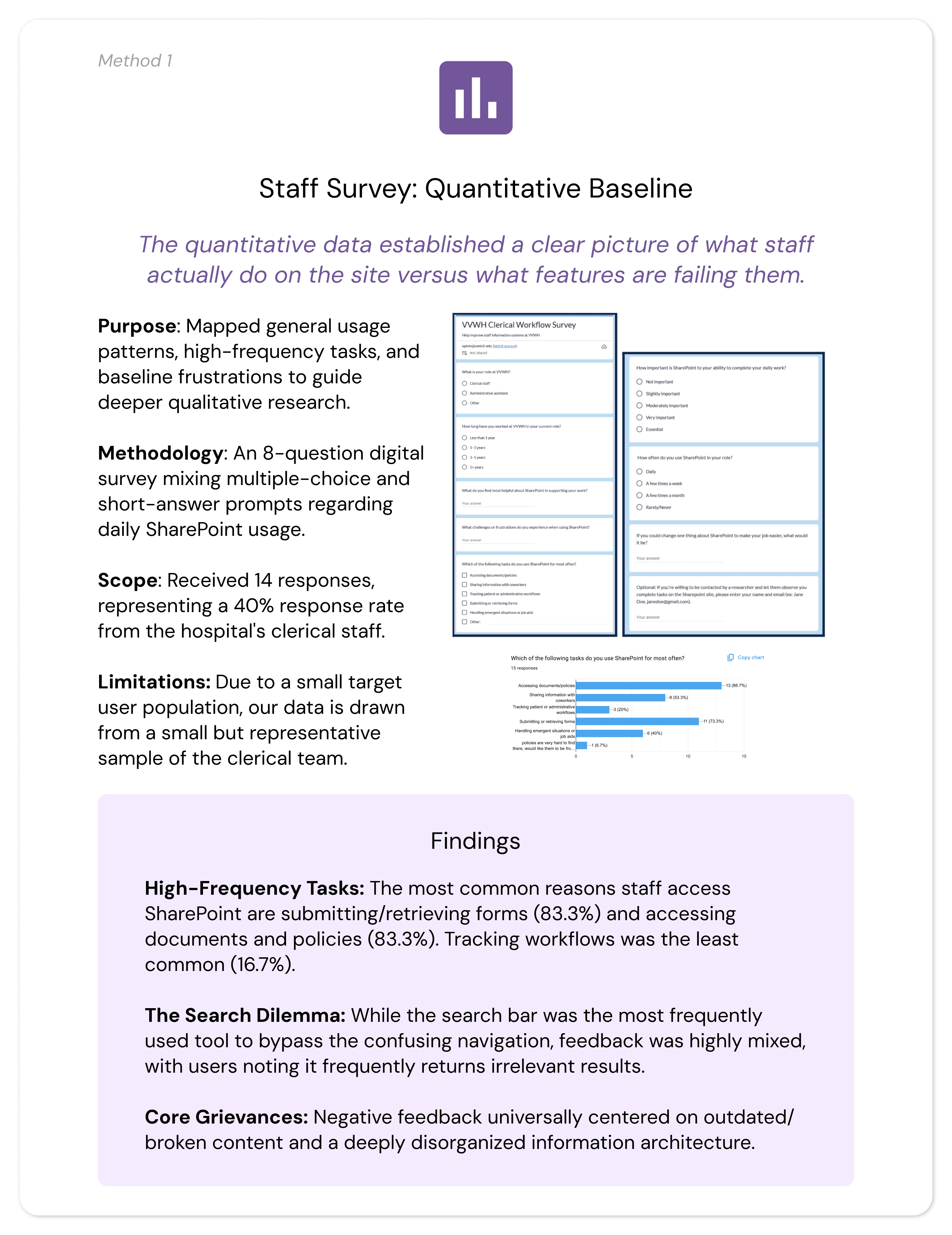
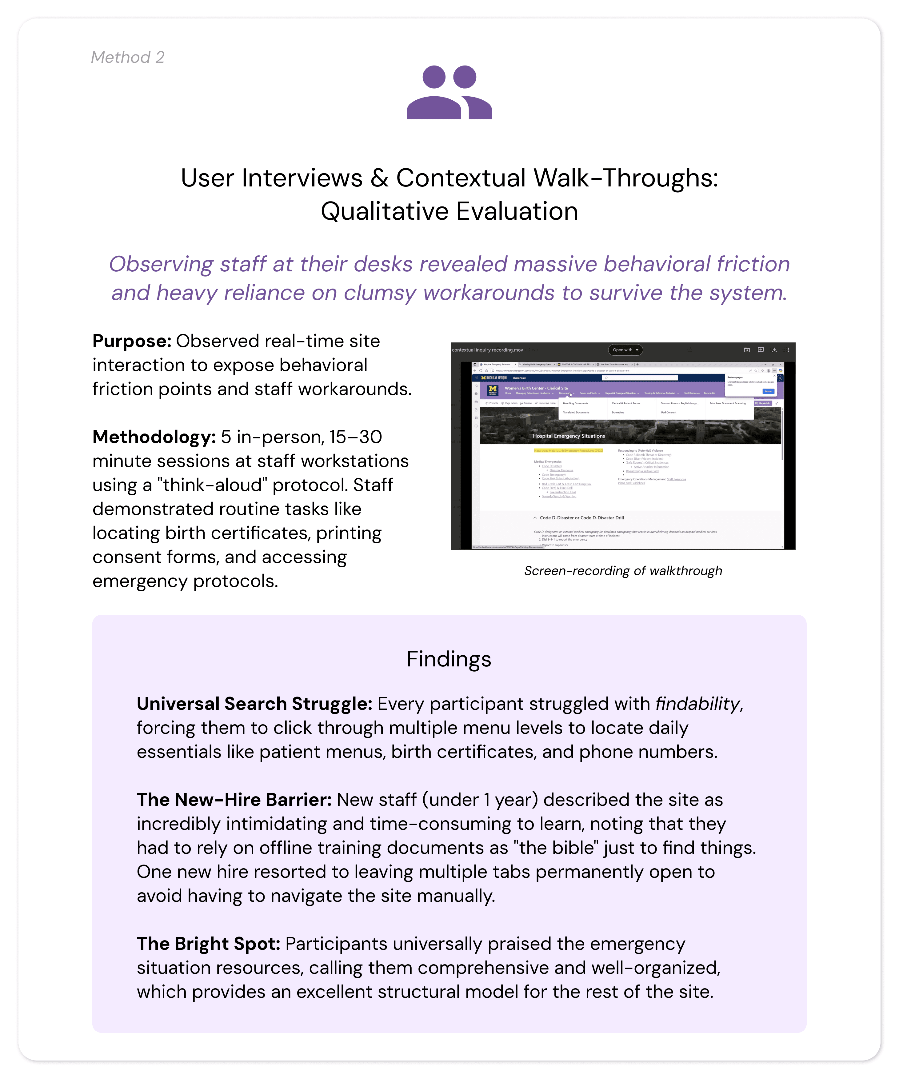
To gather comprehensive data and ensure holistic validation, we employed a strategic, mixed-methods approach combining quantitative data, qualitative user studies, and expert UX evaluation. Research was conducted directly on-site at VVWH with active clerical staff members whose experience levels ranged from six months to over five years.
Research: Analysis / Insights
Analysis (Interview / Walk-through Data)
To translate our raw data into actionable design requirements, our team utilized affinity diagramming to synthesize findings across research methods. We transcribed and organized quotes and behavioral observations onto color-coded sticky notes to visually map relationships:
Overall Insights
Our analysis revealed five major thematic areas where the current SharePoint site actively disrupts clerical staff efficiency and, by extension, impacts patient care quality.
Severe Navigation and Findability Barriers
Even highly experienced staff struggle with lengthy, multi-step processes to execute routine daily tasks. Staff waste critical shift time drilling down through multiple menu layers to locate essential resources.
User Perspective: Participants noted, "The way they have it set up makes it hard to find things," often reporting that they had to ask colleagues for physical help when they "couldn't find it for anything."
UX Diagnosis: The heuristic evaluation confirmed a major violation of Recognition Rather Than Recall. The homepage lacks a "recents" or "favorites" feature, forcing users to completely memorize complex, multi-layered click paths to find basic files. Furthermore, a total lack of breadcrumb trails leaves staff visually disoriented within the site hierarchy.
Inconsistent Information Architecture (IA) Mismatch
There is a fundamental misalignment between how the digital system is built and how the human staff actually think and work.
User Perspective: User interviews highlighted intense confusion between overlapping, ambiguous categories like "Consent Forms" versus "Clerical and Patient Forms," forcing staff to abandon the navigation bar entirely and guess via the search bar.
UX Diagnosis: Card sorting exposed a critical mismatch: staff organize information by task-based workflows (e.g., Admitting Patients, Birth Documentation, Urgent Situations), but SharePoint is rigidly structured by document types. This creates an immediate violation of Consistency and Standards.
Lack of User Control and System Autonomy
The interface frequently traps users in digital dead ends, stripping them of control during time-sensitive patient care scenarios.
User Perspective: Participants described feeling completely "stuck" when links suddenly became disabled after other departments altered background files, forcing clumsy operational workarounds or immediate IT intervention.
UX Diagnosis: The site violates User Control and Freedom. It provides no built-in back buttons, and multiple external links completely route users out of the SharePoint environment with zero return pathways or breadcrumbs to get back.
Steep Learning Curve and Inadequate Onboarding
Because the system is unintuitive, onboarding new clerical staff is a highly inefficient, manual process.
User Perspective: New staff members reported that learning to use the site was incredibly time-consuming and required them to treat offline training materials like a "bible." To survive the shift, new hires resort to fragmented personal coping mechanisms—such as leaving dozens of browser tabs permanently open.
UX Diagnosis: The system lacks tailored Help and Documentation. The built-in help features only link out to global, generic Microsoft SharePoint tutorials rather than providing localized, VVWH-specific task workflows, leaving new hires to learn critical hospital processes through stressful trial and error.
Disconnect Between System Design and User Needs
The research highlighted a telling paradox: the hospital's data exists and is highly valued, but the interface makes it functionally inaccessible in a fast-paced medical environment.
User Perspective: As one participant perfectly summarized: "It's very informational, it's just hard to find it in a fast manner." Conversely, staff highly praised the emergency situation resources for being comprehensive with clear instructions, providing a clear blueprint for how the rest of the site should look.
UX Diagnosis: While the site succeeds at being an information repository, it fails as a functional workflow tool. The lack of clean folder organization, combined with the inability for individual users to save or pin high-frequency items, directly contradicts the fast-turnaround realities of a 24/7 hospital unit.
Research: Design Artifacts / UX Requirements
To bridge the gap between our research insights and the actual system architecture, our team translated our findings into three distinct UX design artifacts created in FigJam: an Affinity Diagram, a User Persona, and a User Scenario. Together, these artifacts grounded our design direction in the real-world realities of the hospital staff, directly driving our final product requirements.
Design
Design Goal + Strategy
Our entire redesign was guided by a single user-centered principle: the interface must work the way hospital staff actually work.
To transform our research into a functional digital ecosystem, we mapped our designs against three strict technical and experiential pillars:
Workflow-Driven Architecture: Restructuring navigation around physical, task-based hospital routines rather than document types.
Friction Reduction: Maximizing quick access to critical tools to save valuable minutes during shifts.
User Agency & Control: Implementing clear recovery paths and personalization to reduce cognitive overload and build staff confidence.
Design Process
We moved iteratively from generative brainstorming to a fully functional, platform-constrained deployment.
Evaluation / User Testing
Evaluation Strategy & Research Questions
To measure the success of our live SharePoint prototype, we conducted rigorous, on-site usability and preference testing, which I mostly took point on. Our evaluation was framed around four critical questions:
Workflow Efficiency: Does our redesigned interface improve task completion rates relative to the original site?
Time-on-Task: Does the new system reduce the time clerical staff spend locating critical information?
Cognitive Load: Do staff perceive the redesign as more usable and less cognitively demanding?
Iterative Gaps: What residual usability issues remain that require further design refinement?
Study Methodology
We deployed an on-site, within-subjects usability and preference test with active VVWH clerical staff members during their live working hours to replicate their natural, high-pressure work environment.
The Sample: We tested 4 active clerical staff members, hitting our target sample size.
The Setup: Participants executed five realistic, high-frequency navigation tasks (e.g., Locating Code Blue emergency protocols, finding patient discharge instructions, navigating to ordering & supplies) on the live SharePoint prototype using a "think-aloud" protocol.
Mitigating Familiarity Bias: Because staff use the original site daily, a purely quantitative speed test would be heavily biased. We utilized a within-subjects design so users could serve as their own controls, coupling performance metrics with qualitative preference testing to measure actual usability improvements over historical habit.
Metrics Captured
Quantitative: Number of clicks, time-on-task, completion status, and Single Ease Question (SEQ) scores (1–7 scale).
Qualitative: Real-time behavioral observations, think-aloud transcripts, and open-ended debrief reflections.
Results
The Next Iteration: Gaps & Design Refinements
A critical component of our evaluation phase was identifying where our prototype fell short of the complex realities of 24/7 emergency hospital operations. We prioritized the following design refinements based on user failures during testing:
1. Instantaneous Emergency Access
The Gap: During the "Code Blue" task, we discovered that nesting emergency instructions inside a subpage was a usability failure. In high-stress situations, staff do not have the luxury of clicking through a hierarchy.
The Refinement: Moved all critical emergency code instructions directly onto the Emergency Landing Page for instantaneous, zero-click viewing.
2. Language Accessibility & Content Depth
The Gap: Staff frequently need access to Spanish and Arabic documents for patient care.
The Refinement: Added dedicated multilingual tabs and consolidated translations directly into high-frequency zones, while expanding the content layout of the underutilized "Losses" resource page.
3. Strengthening Interactive UI Affordances
The Gap: Due to a bias from the old system's flat design, some users initially did not realize certain new cards and buttons were interactive.
The Refinement: Increased the visual weight of interactive elements by introducing thicker card outlines and high-contrast color fills to make hover and click states explicit.
Reflections
Terminology is Everything: We discovered that a few of our initial usability test tasks were slightly inaccurate due to our team's limited familiarity with niche medical workflows (e.g., miscategorizing a patient discharge task within triage). This taught us the critical importance of vetting testing scripts with domain experts beforehand.
Designing for High Stress: Usability needs drastically shift when a user goes from a routine task to an emergency environment. True healthcare UX requires designing zero-click safety nets for moments like a "Code Blue," where cognitive load must be at absolute zero.
Conclusion
Client Collaboration & Handoff
Our team maintained close alignment with Von Voigtlander Women’s Hospital through weekly client meetings, which allowed us to rapidly vet medical terminology and adapt to platform constraints in real time. Special thanks to Adnan Ahmad and McKenna Richardson for your close collaboration and support over the past year!
Because SharePoint lacks a direct "duplicate" feature, we delivered a comprehensive handoff package to ensure a seamless live build-out:
The Handoff Guide: Step-by-step technical documentation and screen recordings showing the client exactly how to replicate our layout configurations natively.
Design Blueprints: A standardized page layout framework detailing column splits, card patterns, and typography to maintain visual consistency as the client builds out remaining sub-pages.
Direct Support: Provided our team's direct contact information for ongoing troubleshooting during implementation.
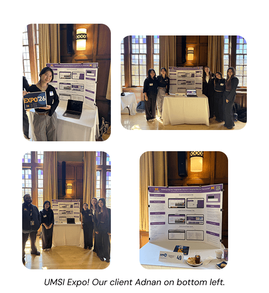
Capstone Exhibition & Future Recommendations
We showcased our final, live SharePoint prototype at the University of Michigan School of Information Capstone Exhibition, receiving strong praise for our platform-first adaptability and deep empathy for frontline healthcare workers.
One interesting conversation I had with an attendee was on the possibility of adding AI integration for a smart assistant, a feature that would be useful to look into for future steps.
Final Takeaways
⚙️ Platform Constraints Form the Design: True UX isn't about making pixel-perfect Figma files; it’s about adapting to rigid real-world systems like SharePoint and design-in-browser to ensure long-term maintainability.
👥 Fix the System, Not the Symptom: While staff initially requested a better search bar, restructuring the underlying Information Architecture eliminated their exhausting dependency on search entirely.
🏥 Clinical Settings Demand Flexibility: When standard email recruitment failed due to hospital demands, going directly on-site to build personal trust was what secured our critical user testing pool.
Watch our prototype video here!